Sunday, September 20, 2009

Elements of Design: Space


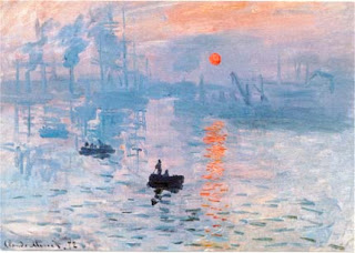
There's such an intense vibe concentrated in all that free area that you just naturally respond to it with a frown ... it evokes a deadly emotion within you, just by looking at the ruins and beauty and simplicity ... and 90% of it is pretty much an empty haunting sea which gets you wondering how so little can say so much ...
Element of Design: Shape


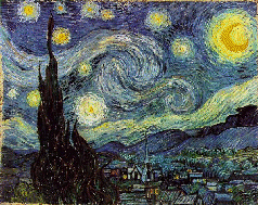
The circular-type motions of the brush that created the swirls and stars and sun and sky exhibit the motion of those natural elements and their infinite capacity to go beyond what is anticipated ... there's that sense of mystery and an other-wordly quality about this painting.
The castle or whatever that is, with those sharp triangular edges, adds an element of romance; conflict and dynamic and opens up a realm of possibilites for the scope of the imagination.

Principles of Design: Variety


Notice how intricate this design is ... it's complexity - what with the dedication to details of several of the elements and principles - gives it an oomph; an 'it' factor. It draws you in.

Elements of Design: Form


Each chess piece has a very definite form; its volume is evident. That adds to the charm and boosts its menace factor.

Elements of Design: Colour


This depiction of an aurora features a unique blend of colours that together evoke the sentiment of the supernatural ... of something fantastical and otherwordly.

Saturday, September 19, 2009

Principles of Design: Rhythm


There's a strange beat to this piece ... it gives off an air of a light breeze that's showering the ground and sky with those soaring blossom petals. There's something tangible about it.

Principles of Design: Harmony


This piece pleases the eye ... harmony is about giving a piece an impressionable perception by making all the elements and principles work together somehow. This is a very idealistic setting and to be able to convey that peace you can find if you were physically there illustrates how Monet demonstrated unity. In short, it looks right.

Thursday, September 17, 2009

Principles of Design: Balance


Notice how part of the tree is much denser on one side of the painting. Is it obvious at a glance? No. Thus, we can deduce that the contrast between light and dark showcases a natural, secure look and feel. Nothing looks out place or lacking which is precisely the impression it's supposed to give off.

Principles of Design: Proportion


Proportion ... by making this lady larger than the child, it can be assumed that she is an important figure in his life. By itself, she could simply be considered a lady with an umbrella. But with the boy in the distance, it adds meaning (which is what proportion is all about).

Principles of Design: Emphasis


Emphasis ... an obvious example BUT effective: your eye just automatically turns to the bed. Conversely, the empty floor may also be stressed.

Elements of Design: Texture


Texture ... the glossy feel of the pear is very discernable in this piece.

Elements of Design: Shade


Shades ... an assortment of hues from the green-yellow side of the pallet. To differentiate between the sky, trees and grass, these shades offer a 3-D sense (the trees especially).

Elements of Design: Line


Line ... an ensemble of loose lines to create the motion of the house and her surroundings. For example, the house, bridge, wall, smoke, etc ... You can feel the bold strokes of the artist ... very definite and prominent.


Here, there is such detail put into the corridor ... the pillars and archways and even the floor! Unlike the other example, these lines are sharp and flow in a similar style in such a way that you are able to sense the authorative aura ...